Photo Credit: Searchlight Pictures
How The French Dispatch is the epitome of an Anderson-esque film
By Tannaaz Zaraineh, Lifestyle Editor
I was talking to a friend the day I wanted to see Wes Anderson’s new film The French Dispatch, and I was completely stunned that she hadn’t ever heard of him or this film (and then we quickly proceeded to shun Dune for its absurd boringness). I thought to myself, how many others have not seen this man’s masterpieces? As a long-time fan of Anderson’s work, I knew what I was going to write about: what makes a Wes Anderson film a Wes Anderson film, using The French Dispatch as an example.
Let us begin:
Continuity, Zooming, and Brazen Cut-Scenes:
This is a classic approach that you’ll see all over his films, and it starts right off the bat in The French Dispatch. There are many scenes that either instantly cut to the next in an abrupt manner or zoom in what’s called a ‘crash zoom’ for extra emphasis, but Anderson still provides the sense of continuity. That is, it still feels like the scenes are stitched together and nothing from the story is lost. One of his many talents includes telling a narrative. In this new movie, the story is clear, even though it’s more like there are three different stories compressed into a larger one. Sometimes this tactic gives comedic relief, as many jokes written in the script are dry and are slipped into what could be seen as very normal conversations or scenes.
The Visuals:
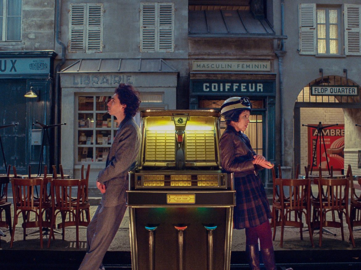
Every single movie of his has a distinct colour palette and aesthetic. Anderson normally goes for a 20th-century look, usually taking place between the ‘50s to the ‘70s (not including Isle of Dogs). His colours are rich and saturated, his characters still able to pop against already colourful backgrounds. Interestingly, half of The French Dispatch was in black and white except for the present-day scenes and short moments during the past so viewers can get a glimpse of what the characters had seen in a given moment. However, Anderson still offers what he usually does. This movie has lots of blues, greens, and yellows, with pops of reds, pinks and oranges scattered around and they are all interconnected throughout the film. What’s great is that his retro colour choices coexist with his selections in set décor, and this director is renowned for being able to create aesthetically pleasing rooms, as if specifically made for fans of interior design. According to Elle Decor, the set was created using vintage French furniture found in flea markets that were scrounged through for six months. Anderson is known to use miniatures in past films, and this time is no different: the airplane scene, for example, mixed a miniature model the crew made and merged it with a life-sized scene. Seeing this was a treat since it makes the audience appreciate the extra craftsmanship and care for his imaginative films. Who would’ve thought! The director is also a fan of symmetry and composition. As stated by Shutterstock, his films would appear much more disorganized and cluttered if he didn’t use symmetry to create a point of focus. As mentioned before, if you’re a fan of deadpan humour, there’s plenty found in his films, including The French Dispatch. Sometimes it’s not just the dialogue or special effects — his unconventional characters mix with his compositional shots to make audiences laugh too. He also uses a lot of text over the course of his films to narrate, specifically using the Futura font. Now no film of his could be a Wes Anderson film without it. It’s all part of him being a very visual person.
A Stunning Cast:
He’s known for casting a whole bunch of A-Listers for his films, and usually, he casts the same group of people, but you never see the same type of character twice, even if his stories revolve around the same themes concerning spirited people and revolutionists. A New York Times article discussed how Anderson does this simply because he enjoys working with the actors and sees eye-to-eye with them. He’s also said that he enjoys the idea of creating a small group similar to a theatre company that goes everywhere together and creates together too. To create more natural scenes, he invites locals to act as background actors and wants them to come with their own pets.

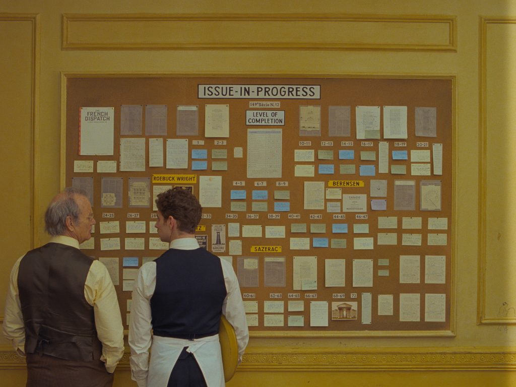
Arthur Howitzer Jr. (Bill Murray) and his head caterer (Félix Moati) at the office of The French Dispatch. (Searchlight Pictures)
Anderson definitely understands the concept of creating wistful fantasy worlds that suck you in to see colourful cities full of eccentric characters. Maybe like me, you sense ‘anemoia’, the term for feeling nostalgic for an era you didn’t experience. The French Dispatch, although providing much of what I’ve described, and touching many aspects of Anderson film, slightly missed the mark for me. Parts of the storyline were muddled together and hard to piece together. Personally, it’s not my absolute favourite due to the plot and structure of the film, but if you enjoy writing or journalism like me, this is a movie you must see. As Anderson has put, it’s a “love letter to journalists.” Plus, it’s a bit shameful in general to not see it at all if you’re a fan because it was still beautifully and eloquently produced, as usual. If a director were to be named for being able to paint a film, my bet would always be Wes Anderson. His next anticipated film is Asteroid City, and it’ll be exciting to see how these elements discussed will perform together next.


